Appointment Manager Redesign
Goal: Integrate the Block Design Standards with Appointment Manager, and increase the amount of virtual-centered clients.
Team: UX Designer: Jamie Finkelstein; Content, Sarah Henry; Product Owner, Rodney Wasson
Happy path prototype. Additional prototypes available for demo.
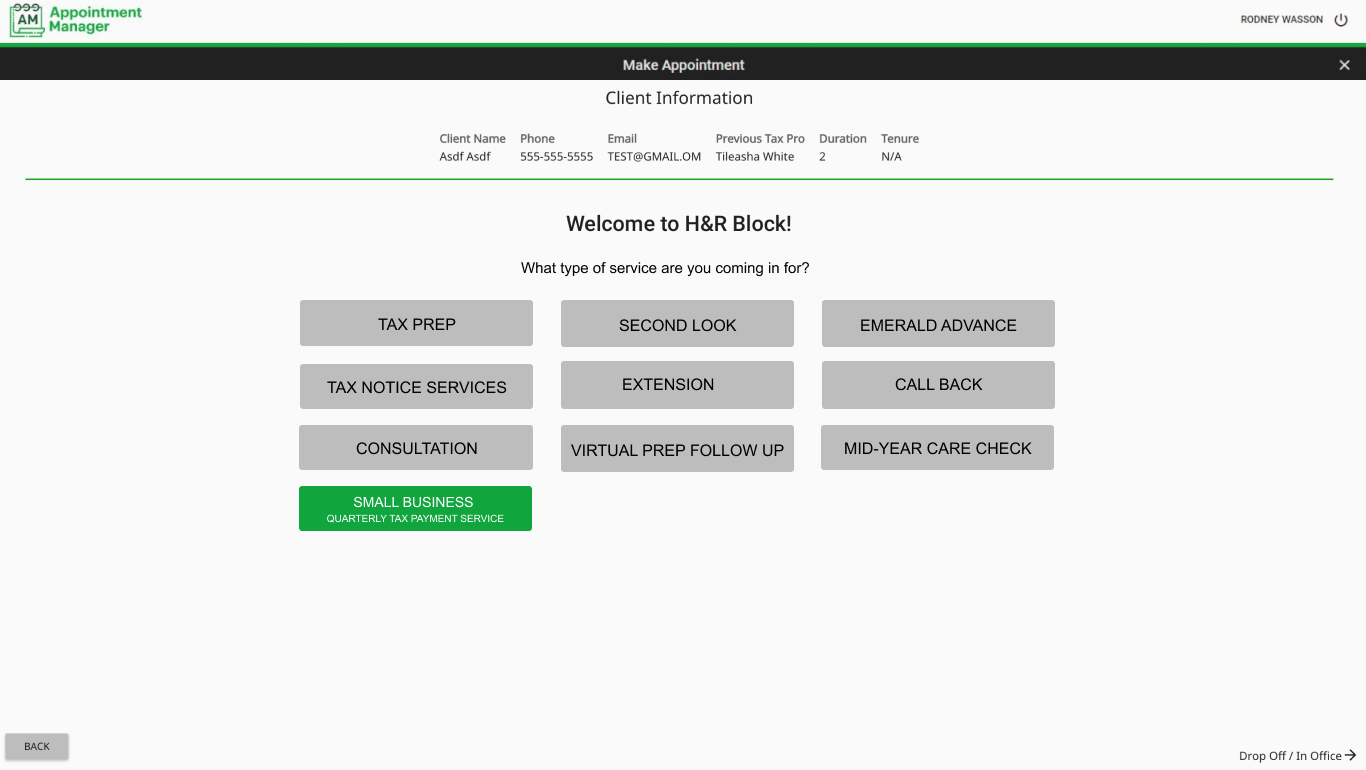
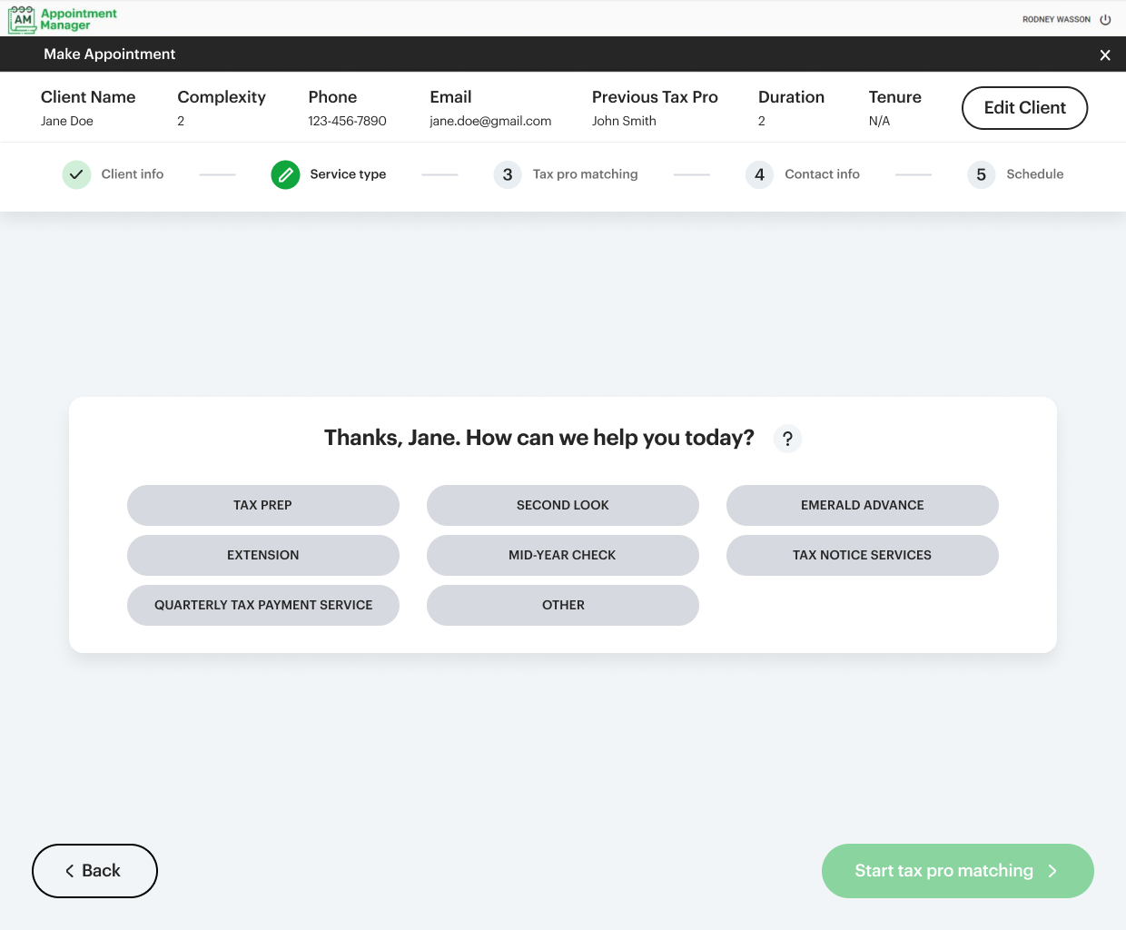
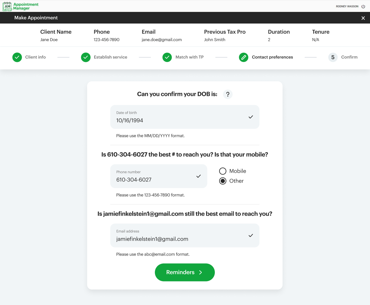
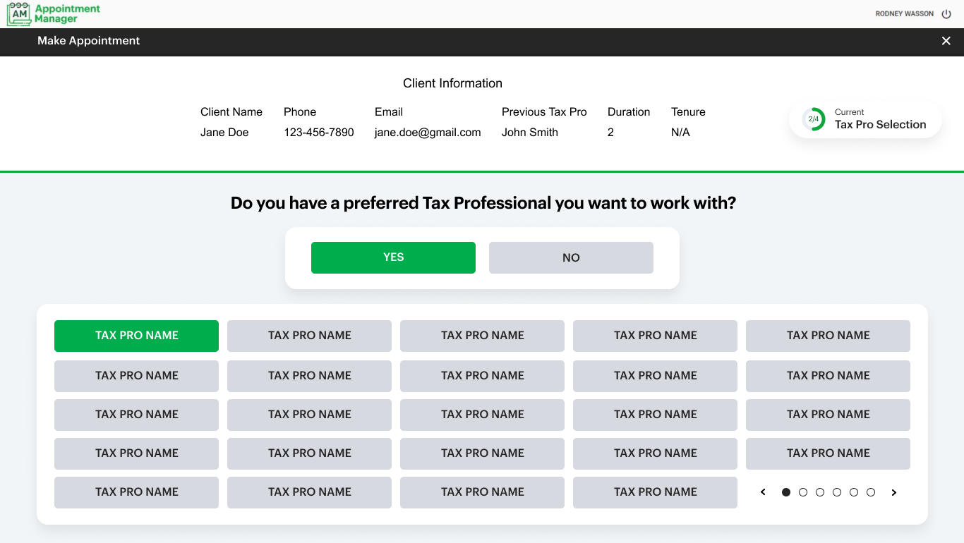
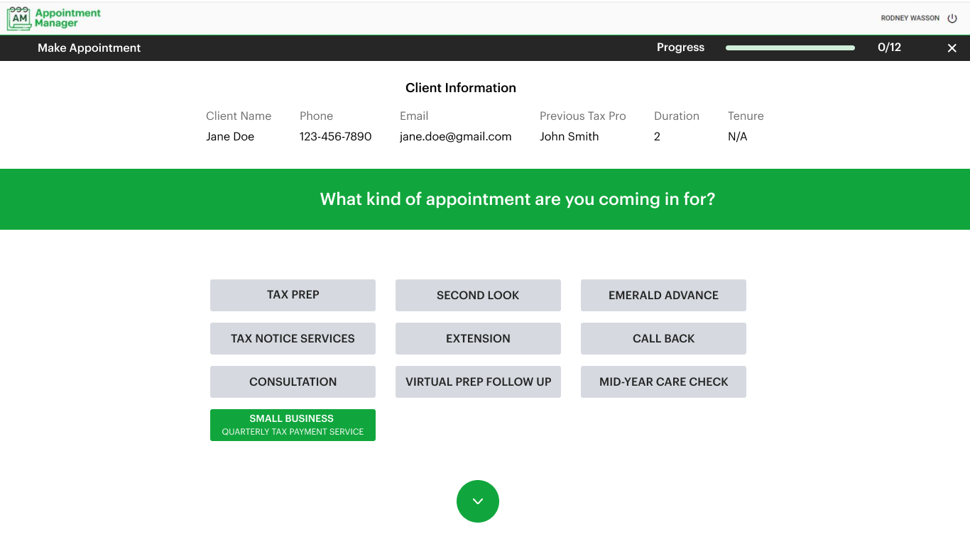
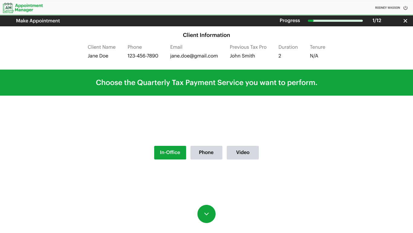
Appointment Manager is the main tool that H&R Block employees use to schedule user appointments (virtual and in-person). The goals of the redesign were to bring the UI into the brand guidelines, and center on a virtual focus and move clients towards digital options.
AM before
AM after
Since the redesign shipped for tax season 2022, scheduled video appointments went up from 9,000 in 2021 to 66,000 in ‘22. We landed at 24.4%, virtual tool usage - an increase of 16.60% from last year.
Exploration
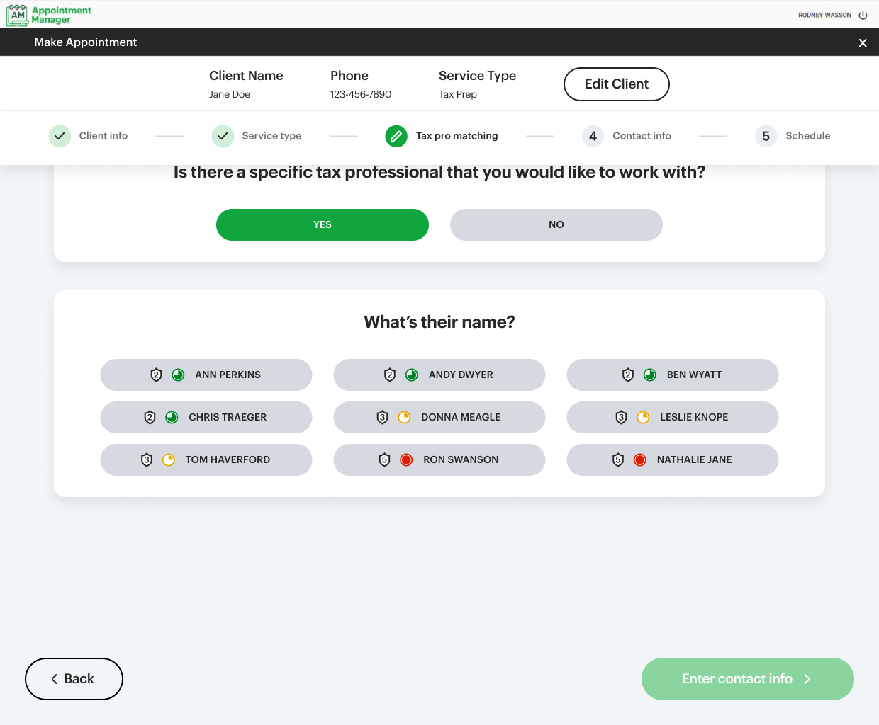
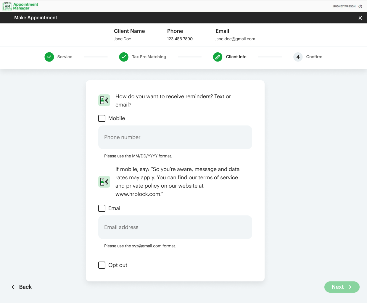
Focus areas: navigation, form layouts, presentation of questions (UI/UX).










Testing
-
I began my research by sending two Microsoft Forms surveys to 300+ associates.
Key Insights:
• Associates prefer optional scripting
• Associates prefer to see 2-3 matching questions and all service types at once
• Associates want to keep all existing client header details
• Associates want to see a digital drop off option
• Associates prefer less action to more organization (ex. – they want to see everything listed out rather than hidden in sections)
• Based on the initial feedback, I decided to change several flow and UI elements.
-
19 one-on-one user tests over Microsoft Teams (30 min. each). Each interview focused on different paths/questions. I shared my screen with each user and had them run through what option(s) they would select when given a specific task to perform.
Main goals of this stage of testing:
• Identify happy paths for end to end flow
• Refine iterations to send out for feedback on a larger scale
• Understand any concerns or pain points
• Record any comments, positive or negative, that might influence the design
Key insights:
• Shorter, simpler, more direct questions
• More/alternative answers (ex. – “I don’t know”)
• Need a clearer indicator of section breaks
• Link the need for digital upload and appointment setting
• Increase flexibility for users
• The flow generally makes sense, and the design was received positively
Based on the conversations during this testing stage, my content partner and I went through several variations of questions to make them as clear as possible. We shortened most questions to 1 or 2 sentences. Other questions, though, were more of a challenge.
-
Early September 2021: Using usertesting.com, we were able to randomly select 12 individuals to run through our prototypes. These users had never seen or experienced HRB’s appointment setting flow, so they were the perfect group of unbiased people. Here, we tested with the goal of identifying any issues with the flow, content, design, and follow up messages.
Results were generally extremely positive on the designs and varied on the content. We had some more work to do.
-
Late September 2021: After refining some content, we tested (and are currently testing) with individuals via phone only. Since the users in reality will never actually see a screen, we wanted to understand how people would react to hearing the content. We have had overall positive feedback, but are still working on refinement.
